

Award-winning podcasters Damien St John and Ant McGinley expose the make-or-break element most creators overlook: your podcast artwork. That tiny square is digital real estate making thousands of first impressions daily. While you obsess over content, potential listeners judge your show in milliseconds based on visuals alone. Is your artwork inviting new listeners or sending them scrolling?
We uncover the critical mistakes that kill discoverability, reveal what top-performing shows understand about visual psychology, and share free tools to transform your brand today. The truth? Your brilliant content means nothing if your artwork doesn't stop thumbs from scrolling.
Affiliate: Bad internet ruining recordings? Riverside captures perfect audio and video, whatever your set up. Start recording with Riverside for free now at https://bit.ly/podomedy-riverside
If our battle-tested insight is useful, why not buy us a coffee? Get started at https://buymeacoffee.com/podcastadviceshow
[00:00:00] Is bad internet ruining your recordings? Well, Riverside captures perfect audio, whatever your setup. Riverside means no loss in quality, whether it's audio or video, and local recording is ideal for pro-quality podcast production. So keep the perfect take with Riverside. No more dropped calls or connection issues. And you can start for free by hitting the link in our show description.
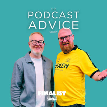
[00:00:30] Hello and welcome to The Podcast Advice Show, the podcast for podcasters. I'm Damien St. John, he's Ant McGinley, and this is your go-to place for the latest tips and takeaways. This episode is called Podcast Artwork Hacks, How to Create Covers That Convert. Do you have a preference before we get stuck into it for artwork? Because you are quite a bold, colourful character. So what sort of artwork jumps out to you when you're looking for a new podcast?
[00:01:00] Exactly that. So one thing I actually try and stay away from is if I see podcast artwork that has that clip art picture of a microphone and headphones, I'm like, next. Thank you, next. You're just saying I'm a podcast. You don't need to tell them, and that's a waste of space that you could fill with something else.
[00:01:24] Yeah, I agree. And I think podcasting has moved on now so that we all understand it, but there were no guardrails or suggestions for podcast artwork back then. So I think people ended up doing that, which is why today we're diving into a topic that might seem superficial, but is absolutely critical to your podcast success. That little square image is, as I mentioned, digital real estate that makes your first impression thousands of times every day.
[00:01:50] Your cover art can either invite new listeners in or send them scrolling past without a second thought. Many podcasters spend countless hours perfecting their content only to slap together artwork as an afterthought. In this episode, we'll cover the biggest mistakes podcasters make with their artwork, what the most successful shows get right, plus a list of free tools that you can use today, and even how you can check if your artwork meets platform requirements. So let's start then with a look at what not to do, comma mistakes.
[00:02:19] There's a list of top five here. Do you want to go through these? At one, overcrowding. Have you got too much text, too many visuals, too many things going on? Remember that for most people, it's going to come out as a tiny little thumbnail, smaller than this. That's my thumb. Yeah. You probably never see your artwork as a podcast listener on the 13-inch, 15-inch screen that you're working on. Overcrowding is a massive issue.
[00:02:46] Trying to get your brand across in a sort of almost impulsive way, I think is really important. Maybe overcrowding. So what are the elements in that? Podcast name, host name, main image, podcast host image, background. Do you know what I mean? It suddenly becomes quite busy, but some of that you probably don't need.
[00:03:13] Would you say, how important would you say is to have your face on your podcast artwork? How do you differentiate when and when it isn't important? It depends how big your face is and how recognizable it is. No, seriously. It's like if you have, say for example, David Beckham, right? David Beckham, one of the most recognized faces in the world. If you have the David Beckham podcast, even on a thumbnail, you might well recognize that face.
[00:03:43] So there may be then, in those circumstances, use the face. But I think if you're trying to build a personal brand as well, like if you are, remember that doctor that we met, Dr. Liz? If you're building your personal brand and what you go on to sell, either in terms of courses or patrons and stuff, I think that kind of does make a bit more of a difference to being a bit less faceless, but not on every podcast. I mean, we're on this podcast. It's because we're good looking.
[00:04:12] Well, but I think because this is, speak for yourself, I think this is advice driven. So it's got to come from a person, right? Now then, give us another common mistake. We think podcasters make in their artwork. Having really bad legibility, especially when it comes to down to that thumbnail size. And the industry standard is currently 3000 pixels by 3000 pixels. It's quite annoying because it's often a size that when you automatically put into 3000 pixels by 3000 pixels, it's too big a file size.
[00:04:41] It's a bit tricky to do. But once you've figured out how to do it, you can get through it. You can get away with 1400 though, right? That's the minimum, super minimum. Well, it was the minimum. It's now Apple have changed that and now they're shifting the minimum to 3000, I believe. I believe. So this is something, when you talked about those kind of clip art images, this was something that wasn't in play 10, 15 years ago, right? So if you started a podcast and you didn't, you just thought, well, it's square. It's good enough.
[00:05:10] Actually, you might be falling foul of some algorithms, especially on the old Apple. Because nobody really knew what they were doing. There was no set standards of what to do. People just looked to see what everybody else was doing and went, okay, they've got a picture of a headphones and a picture of a microphone. I need to have that or I should do what everybody's doing. Square is the size, right? It's always square artwork. For the time being, for the time being, it could change. Suddenly goes to triangles. That's the new thing I'm hearing.
[00:05:38] Generic stock photography that fails to differentiate. That's kind of one for me. Like if you're not, if you're going to put a face on it, make it your face. And if you're not, just put a nice color on there. Color is a really interesting way of getting your brand across. So if you're sports, if you belong to a certain club, logically try and use that color because you're already going to make an association. Otherwise do green if you're sport, because green is like the universal sports color for most.
[00:06:05] Before you choose your artwork, go to the category that you think you're going to be in. Niche right down and look at what already else is out there. Now the chances are whatever podcast you do, whatever subject that you do, you are not the first. There is somebody who has already done one and has stopped doing it or has been doing it for a long time. Don't let that put you off. Come and join the party. That a lot of them will have very similar themes. They will either show the same kind of image. So if it's the club, they might show the club badge.
[00:06:34] If it is, they might show the club colors. Think about it. How does yours going to stand out? If you follow that same recipe and you put your artwork in there amongst all those, does it just blend into the background? How do people know to make it stand out though? So if it pops a little bit, that's what you've got to think about. So maybe, you know, you, maybe you use the away colors that you play in rather than the home color. So everyone else is doing red and white.
[00:07:02] You wear the yellow and blue on your, your podcast artwork. That also may help you shape actually what your podcast is. Because like, if you would, if your podcast was called away days, then yeah, absolutely flip it. If your podcast is all my favorite matches, well, where's the sort of differentiator there? So yeah, it is a, it is a conversation you should be having at the beginning with yourself, at least at the beginning of your podcast idea, not just at the end. Yeah.
[00:07:30] You can get penalized for low quality artwork, believe it or not. Again, 10, 15 years ago, no one really cared. But now, as I mentioned, there's sort of specific sizes. Apple does the 3000 by 3000 pixels. It's got to be JPEG or a PNG, or do you pronounce it JPEG or JPEG? Why isn't it JPG? I'm just looking to see if podcast is a language on Duolingo. If your artwork is not like following that, and there are loads of guides on there online
[00:07:59] that can tell you, then you might fall foul of not getting those kind of homepage opportunities. We've pitched quite a few shows into Apple's promotional space. And you have to read, you don't just have to do your square artwork. You have to do hero art and slightly different. So if you've got an iPhone, if you're lucky enough to have an iPhone and you go through that, you'll see this artwork appears five or six different ways. So actually, even creating your square is not enough.
[00:08:27] You almost do need it now in an editable format. So like if it's in Canva, you've got to be able to resize your background image. So thinking high quality straight off the bat when you're designing it is really important. And I guess that feeds into perception, right? It's quality in the front of the store or lack of is going to imply quality in the shop. How do you kind of feel like an Apple store or an Ikea store without feeling like a Poundland?
[00:08:55] Well, I mean, I personally, I quite enjoy a Poundland. So like the thing is, if that's what you're looking for, if that's what you're looking for, you know, that's fine. So does it sit in with your brand? I think really, and you're more of a brand guy than I am, but I think really when it comes to your show artwork, like with your show name, it is one of the first points of interaction that people are going to have with your show. So before we break, then you're winning strategies on artwork.
[00:09:23] Focus on a single strong visual concept. Don't be afraid to do less is more. It does work. Use bold, simple typography that scales well. Creative and distinctive and memorable color palettes. Again, less is more. Maintain consistent templates across your episodes. If doing episode specific artwork at all and balance simplicity with personality. Speaking of which, Ant is going to take us into the break. Yes.
[00:09:50] And when we come back after the break, we're going to share with you some tools that can help you make all these things. And also, if you've already done it all, check how well it's performing. We're back on the podcast device show. I'm Damien. He's Ant. This episode is called podcast artwork hacks. How to create covers that converts. Let's go through some tools then that will help people create podcast artwork better.
[00:10:18] We've talked about the do's and the don'ts and what we think people get right or what we think people could improve on. But then how do they actually go and do that? Because the majority of people listening aren't graphic designers. But technology, I think cloud-based technology has closed that gap so significantly that most people at some point will come across some basic editing tools online. Canva is number one.
[00:10:44] Canva, if you talk to any graphic designer, they get a bit snooty about Canva. Partly because it does the basics much better and quicker than the majority of tools. And so like my analogy is like you use Adobe Audition to edit, right? I like you was in radio for a long time and that was sort of the industry standard for presenters that or, or Sadie, which is a door, but I don't use that now. I use Reaper because it's easier and quicker for basics.
[00:11:13] For me, Adobe Audition for editing just got bigger and more confusing and more powerful. And I was like, I don't need a Ferrari to go to Tesco. I just need something that's going to get me there and back. Mate, once you've been to Tesco in a Ferrari, you never look back. Well, I have tried, you know, but it's the speed bumps that we're going to get. But that's the analogy, right? Is actually you just need something clean and simple. And Canva, you can do Canva for free if you want to start using it. But like the majority of stuff I do now from basic design and even to a point video editing,
[00:11:43] although it's really clumsy for video editing is Canva. So a friend of mine who shares the exact same birthday, Brian Fanzo out in the States, he is a superb designer and he used to work with UFC and all these big brands like that. But he actually moved away from using Photoshop and just the last time I spoke to him anyway, he was doing everything on Canva. And the reason for it was, was there was only so much he could do.
[00:12:11] And that stopped him spending too much time on nuances and little things, which you tend to do when you've got a really powerful tool. As you know, when I'm editing things together, I can spend three weeks just getting the right sound effect of a horse falling down the stairs. Um, so there's a, there's a practical reason for using that as well. It's good enough. I think that's the thing is it's been good enough rather than being perfect. The bus advertising is digital. Now, if you're listening to this on the bus or you're out and about next time on the street,
[00:12:40] have a look at those digital bus ads that move around. A lot of that is image plus two or three things that kind of swipe across the screen. And there's an effect. A lot of that is Canva or very similar to Canva because it doesn't need to be, to Ant's point, any more complicated than that. So I'd honestly start with Canva and kind of have a play around and don't be afraid to do it. What's changed the game, I think, to make people understand how graphic design works is templates. So you get a lot of templates for Canva.
[00:13:09] You can certainly go football template and it will give you a good starting point for you to customize, but also the grid lines. So where aesthetically things should go is personal taste, but actually how you would align this stuff. Canva and all these other tools will just help you line it up, follow the line and it will kind of stop. So don't be afraid if you're not doing anything or you're paying people to do it, fine. Why not save you some money and try Canva? Other worthy tools of note, GIMP. Put your safe search on.
[00:13:38] I don't know anyone that really uses it, but for a long time it was an alternative to Photoshop. Pixlr, P-I-X-L-R. You can get cute with Unsplash and Figma. So Unsplash will give you copyright free images and Adobe Express. But to be honest, I find the Adobe Suite generally, other than Adobe Enhance, which will do a really good job of cleaning up your podcast audio if you're not using something like Riverside. Generally, I find the Adobe Express Suite still a bit clunky,
[00:14:06] like they're wedded to the Adobe way of doing things and you've got to learn that, whereas Canva feels super intuitive. The other tool that I use, and I've had it for a while on Mac, and I think it's like $40 lifetime fee, is Pixelmator. And now it's part of the Apple family. So it was kind of like this indie bit of software that would do, again, all the basics of Photoshop. But if you've got a Mac and you want something a bit more, I just need an application on my computer, go for Pixelmator Pro.
[00:14:34] But there are tools out there of any budget. And in theory, once you get your artwork right, set once, you can kind of do a set and forget. Podcast artwork checker tools. Have you heard about these things? They allow you to work out whether it's kind of sized right, whether it fits your sort of platform specifications. I'll be spelt C-H-K-R-T-L-S, as all these things seem to be. Let's just get rid of the vowels. One thing that I just wanted to throw in,
[00:15:03] which is actually a really, it does many things amongst it. It's kind of my go-to thing for it, is Cast Feed Validator. And literally all you do is you go in, you drop your RSS feed or your Apple Podcasts link to your show into the search bar, and then it basically runs a whole series of tests on your podcast, and it comes back and says like, any platforms that you're currently not being distributed on, if your artwork meets the right criteria,
[00:15:32] often it'll come back and they say, yeah, right size in terms of pixels, wrong size in terms of megabytes, which just all these little things that are kind of like backend that could penalize you. So they're not massively important in terms of like, you need to do them straight away, but they will guide you to some things that could help you more long-term and just things that you might miss. So that's Cast Feed Validator. Again, the link is in the notes. When you're looking at when your show isn't growing, or you think you're probably, you're a tennis podcast,
[00:16:02] and why weren't you profiled during Wimbledon? It might be that they did look at it, and then they looked at your artwork and thought, well, no. And they haven't got the time to ask you, oh, your podcast is so great. Would you check that? They don't care. They'll find the one that's next to you. That's got it all. So if you think, if it is still somebody who's in charge of it, if somebody is in charge of those front pages of Apple, Spotify, you know, it's their job to bring more people through, more click-throughs. They want more activity on that page. And so they're going to look, and they're going to have the choice. And if something looks great and ticks all the boxes,
[00:16:32] then it's in consideration. If something looks great, but doesn't tick the boxes, it's going to drop off. Apple's Podcast Connect will check to see if your artwork meets their requirements. So if you are doing all these stuff on Apple, they'll help you out, which I think is really, really valuable. So in conclusion then, why does proper artwork matter? Well, podcast artwork that reflects listener tastes and styles is crucial for several important reasons. You make an immediate connection.
[00:17:01] As Ant talked about, if you're a David Beckham fan and you're doing a David Beckham podcast, a picture of David Beckham is going to make absolute sense. So why become any more abstract than you need to? And actually a really good guide for this, right, is look at what Netflix do or any other streaming platform. And I'm sure there's probably, I'm pretty sure there is a David Beckham documentary on there. So you can go and look. It's in your favorites list, you know, don't pretend. You tell everyone you're into Welcome to Wrexham and it's all David Beckham.
[00:17:30] That guy knows how to clean a barbecue. That's all I'm saying. Yeah, you've seen it. You've seen it. Yeah, it is important. Like if you're doing an art house podcast, then surely your artwork should match up with that. There is an element in branding of like expectations. And if you bump into someone and you tell them what your podcast is about, they've already immediately jumped to some kind of mental jigsaw and your podcast artwork is a part of that. And I think one thing I always say
[00:17:58] with the podcast name as well is if you meet somebody in a pub that you've never met before and you tell them just the name of your podcast, if they can tell you roughly what your show's about, it's a really good name. Similarly with the artwork, if people can look at the artwork and even give you some words, emotions, adjectives of what the show might be, then you're on the right path. Yeah. Good artwork also helps with audience targeting. Ask yourself the question,
[00:18:27] is this show for people like you or for people that you think should be listening? I always say you think more like snakes on a plane than hostel. Snakes on a plane, you know what that's about. Hostel is absolutely not about a cheap weekend in London. What's it about? It's about some kind of murderer in the outback. I was too scared to watch it after five. Discoverability, a podcast artwork, will help you with your discoverability because we talked about the penalisation that goes on
[00:18:55] and trust building artwork that feels off for your target audience can create a cognitive dissonance and potential distrust. Again, back to that, why are you constantly exhausting your audience and the calories, the brain calories they use to understand what your podcast is about when there's another one they can swipe to that feels like an easier, more comfortable fit? Mate, I have to say, I feel like you're throwing me under a bus here.
[00:19:24] I've just about got used to the ecosystem and I'm comfortable with that now. And then you come here today and you roll out cognitive dissonance. Cognitive dissonance? Okay, I'll say it in another way. Brain no worky on... Is that what you want? How basic do you want to be? Here's our new podcast, Difficult Words in English, explained by Damien. The most successful podcast artwork
[00:19:53] operates as a visual handshake with potential listeners and communicates we speak the same language before they've heard a single word of your content. Do you think we could take a step back and assess our own artwork for this show? Well, I know what you're going to say. What am I going to say? You're going to say I'm not really that tall. Yeah. Yeah. So there's nothing wrong with bending the truth on your podcast artwork
[00:20:22] because that is me standing next to you. When you look at the artwork for this show, Anne is a couple of inches taller than what you see. A couple? But it depends if you wear any platforms on and you've got your wig on. But we had this picture taken at the Audio Production Awards and when I put it in for the artwork, I couldn't make the artwork balance. It felt weird that there was, you know, a bloke that was sort of average height and then someone that was taller. So I was like, well, why don't I just cut myself out
[00:20:52] and then just inch myself up a little bit? So in real life, we're not as tall as each other that you would think. But I don't think there's anything wrong with that. And I say that partly because I did it. There's nothing wrong with that. But this show is all about trust. Please, can we do a follow-up social promo to this where we share the artwork that people have suggested for their favourite pieces of podcast artwork? And then we do it a little bit like Tony Hart's gallery.
[00:21:21] If you remember the TV programme. Do, do, do, do, do, do, do, do, do, do, do. And it just comes up with like the name of the podcast and then the age of the podcast. So it feels just like the... Let's do that. I've put you in charge of that. You manage it. I wish you all the best. It will never happen. Exactly. I've got a great idea. Do it. Or yeah, don't give me more to do. It's boss vibes. That's boss vibes. Thank you for listening to the podcast advice show. We'll be coming up soon. If you're listening in chronological order,
[00:21:50] there'll be an episode at the podcast show in London. And if you've got a topic that you'd like us to cover for a future episode, again, you can find us at getpodcastadvice.com. Until then, look your best and stay square. I think it's good podcast artwork advice. Stay square. We're going to do an episode one day on how to end a podcast properly. But today is not that day.
[00:22:24] This podcast is part of Podomity, the UK's podcast comedy network. Why not laugh at what else we've got? Visit podomity.com.